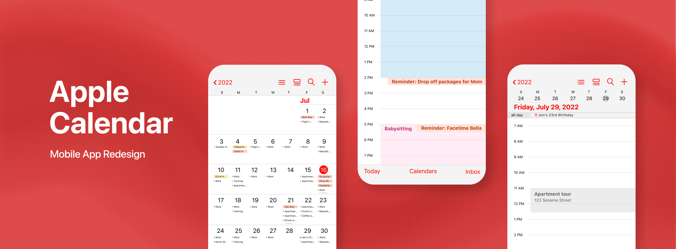
Over recent years, digital calendars have skyrocketed in popularity. Perhaps one of the most rudimentary calendars is the default one installed on your smartphone. For iPhone users, this is simply dubbed "Calendar". Although iPhones and Apple technology is incredibly advanced, the Calendar app falls short of key useful features. Its seamless cross-device interface makes the promise of an all-encompassing app, but in reality, few people actually use the Calendar app because it lacks the convenience and ease they are searching for.
“It’s too confusing and shows me nothing"
After surveying the general public (those who have iPhones), the majority of participants were not currently using the Apple Calendar app to keep track of their schedules. They reported feeling that the app was not as functional as other digital calendars and planners on the market.
“It’s a hassle to use”
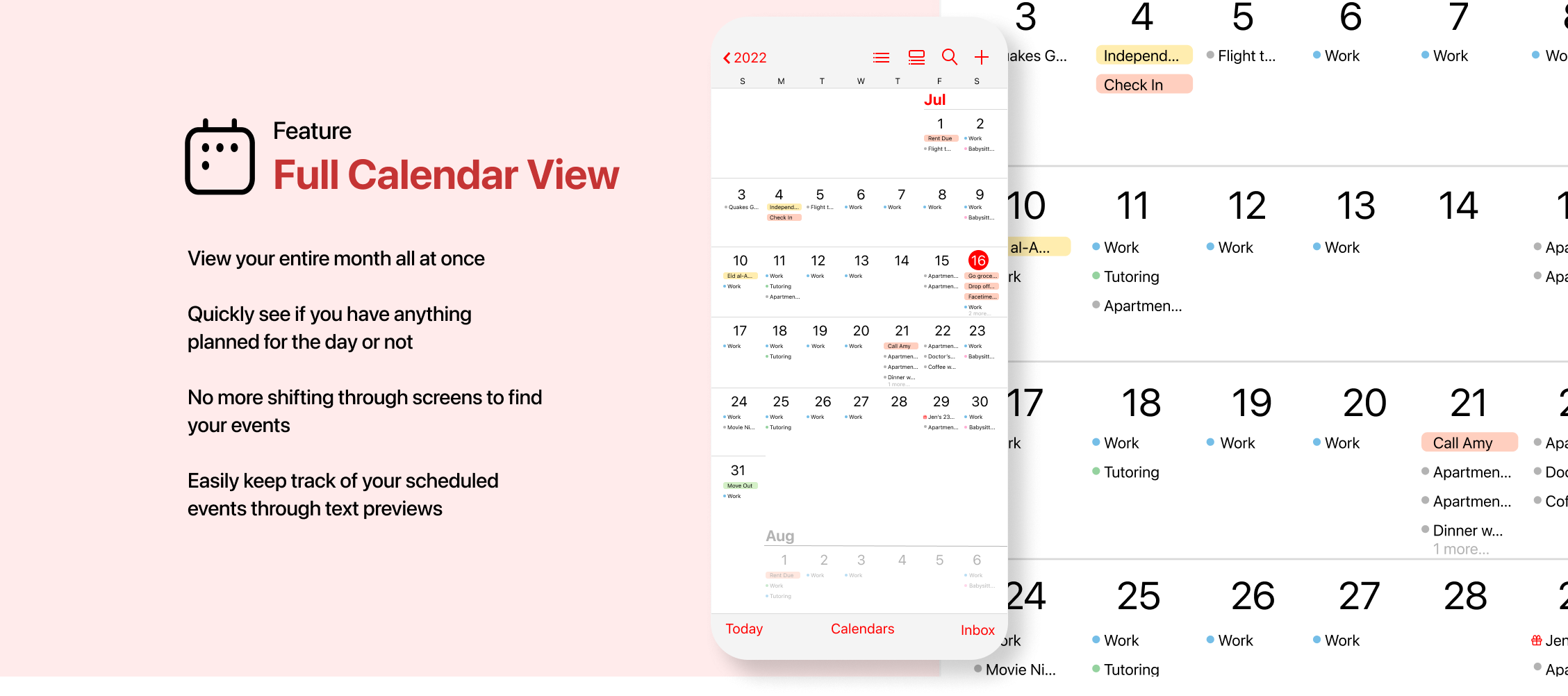
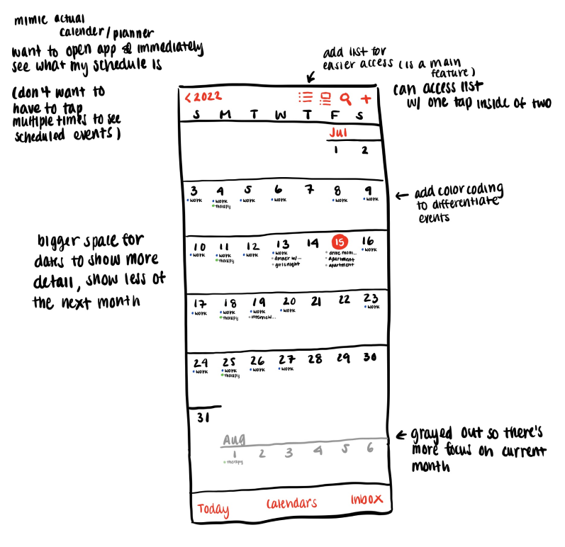
Participants said that it was difficult to just quickly view what they had to do that day because they felt like their events were hidden behind a bunch of screens they had to navigate through.
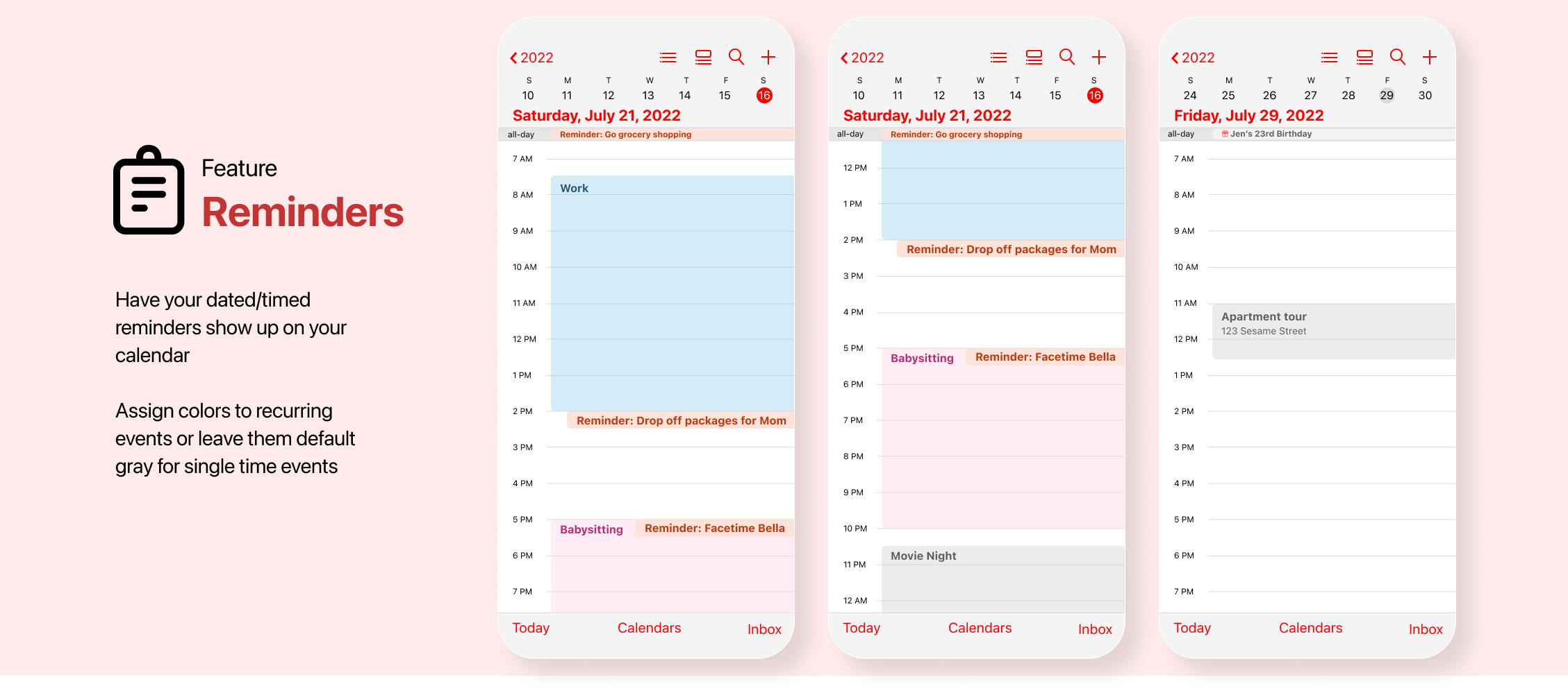
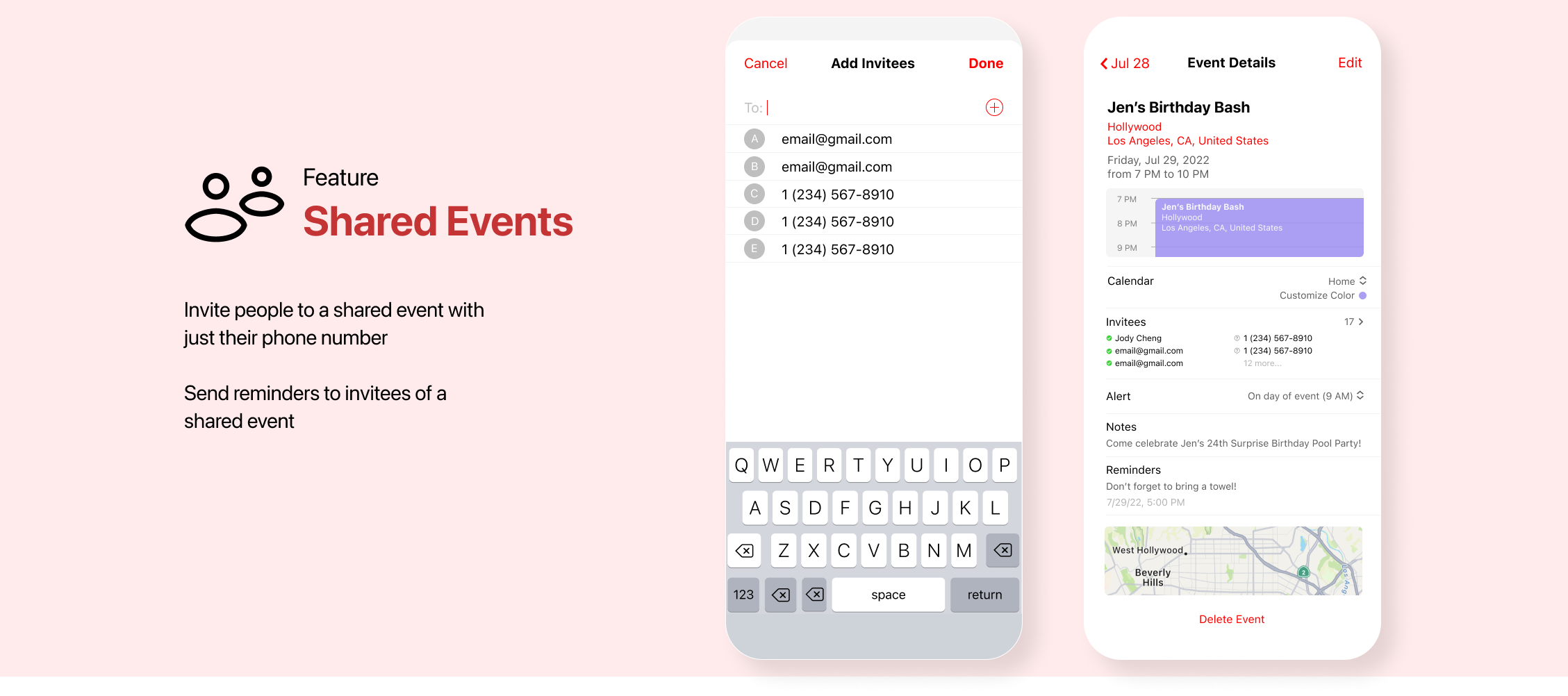
Redesign Calendar with functional features that allows users to efficiently and intuitively plan and view their schedules, and eliminate the need for external calendars and planners like Google Calendar.
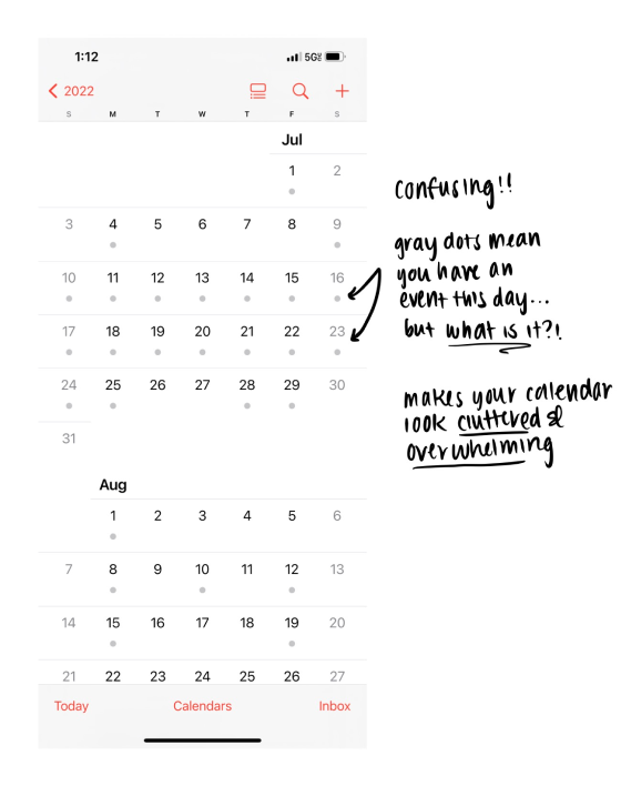
When you take a look at the current Calendar app, this is what you see . . .
The current Calendar app experience is just that, just a calendar. The home page shows the dates of the month and not much more.
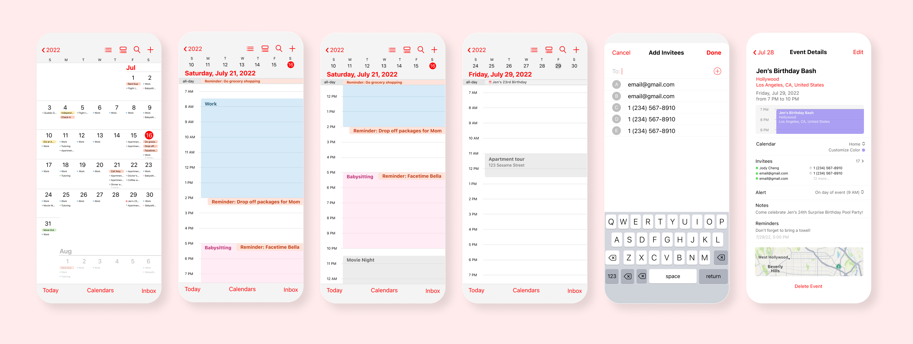
The initial design was constructed with the idea to include aspects of a planner into the calendar to make more effective use of space, optimizing the app for user productivity.
Productivity in this context means spending the least amount of time on the app as possible. The less time you have to spend figuring out what you need to do, the more time you can actually spend doing what you need to do.
This project was my first design with creative parameters, so it did take some time developing the interface layouts to mimic the design of Apple without having a guide. However, once I was able to grasp the techniques on Figma, I gained a lot of understanding of the tools available on Figma.
One thing I think would improve this UI/UX redesign is implementing accessibility practices. Ensuring my designs meet WCAG AAA standard will help make digital products and technology more accessible and inclusive.